Viewport and Browser Testing Tips
Different Browsers
Running all of your tests within multiple browsers and across various screen sizes is incredibly important. Currently, Cypress supports Chrome-family browsers (including Electron and Chromium-based Microsoft Edge), WebKit (Safari's browser engine, currently in experimental status in Cypress) and Firefox.
You can also configure Cypress to run your tests within a specific window size with custom configurations. A great example of how to do this is in the Real World App (RWA). If you look at the GitHub Actions workflow, we will run the tests within the RWA in Chrome Desktop, Chrome Mobile, Firefox Desktop, and Firefox Mobile.
We can tell Cypress to use a specific browser for testing by specifying the browser we want like so:
browser: Firefox
This works excellent in CI, but what if you want to do this locally?
You can pass in which browser you would like Cypress to run in via the command line like so:
cypress run --browser Firefox
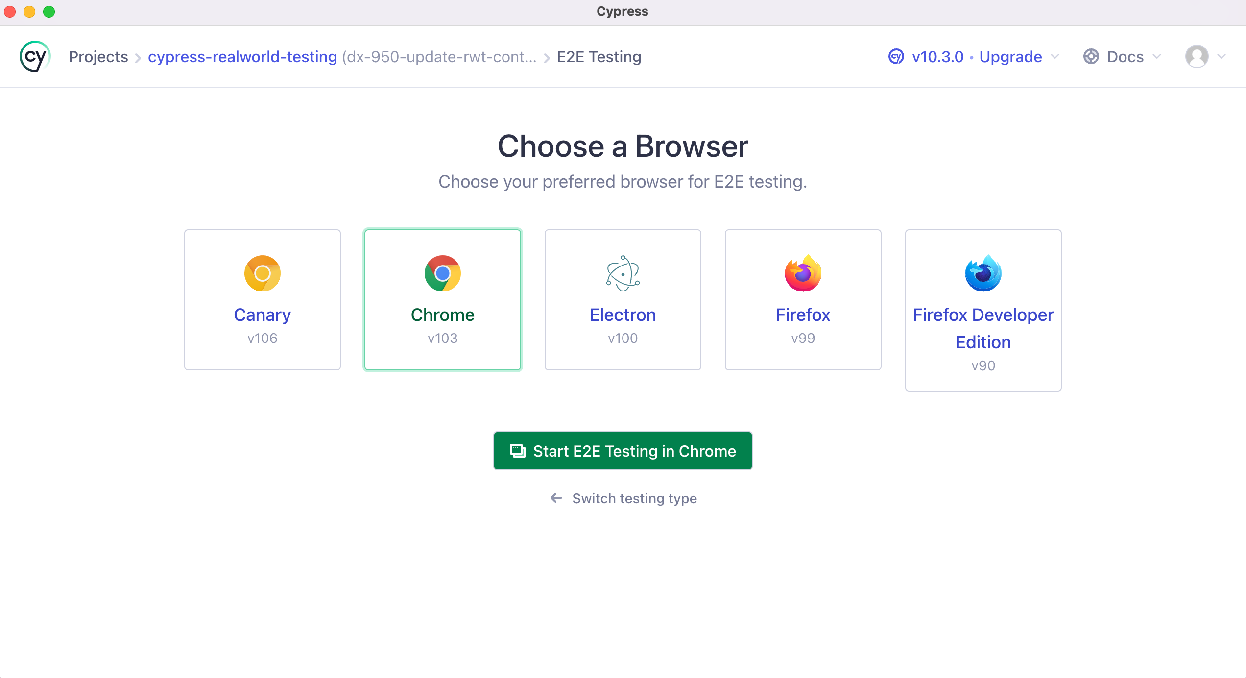
You can also select which browser to run via the UI.
You can even do this on a test by test basis by passing an options object to your tests.
// Run the test if Cypress is running
// using the built-in Electron browser
it('has access to clipboard', { browser: 'electron' }, () => {
  ...
})

// Run the test if Cypress is run via Firefox
it('Download extension in Firefox', { browser: 'firefox' }, () => {
  // ...
})

// Run the test if Cypress is run via Chrome
it('Show warning outside Chrome', { browser: 'chrome' }, () => {
  // ...
})
You can even do this for all tests located within a describe() block like so:
describe("happy path suite", { browser: "firefox" }, () => {
  it("...")
  it("...")
  it("...")
})
In this example, Firefox will run all tests located within this describe().
Testing Mobile
All of the tests within the RWA are written for Desktop by default. Within the package.json, we have custom scripts to launch Cypress with mobile dimensions.
"cypress:open:mobile": "cypress open --config viewportWidth=375,viewportHeight=667",
"cypress:run:mobile": "cypress run --config viewportWidth=375,viewportHeight=667",
As you can see, when these commands are executed, we are passing along some custom configuration that tells Cypress the viewportWidth and viewportHeight to use when launching our tests.
We also have a utility function called isMobile() which determines if our tests are being run at the mobile viewport. Here is what that function looks like:
export const isMobile = () => {
  return (
    Cypress.config("viewportWidth") <
    Cypress.expose("mobileViewportWidthBreakpoint")
  )
}
The configuration value mobileViewportWidthBreakpoint is located within the cypress.config.ts config file. Because it is non-sensitive, public configuration, the RWA defines it under the expose key and reads it in tests with Cypress.expose() (Cypress 15.10.0+). Reserve the env key and cy.env() for secrets you want to keep out of the browser.
export default defineConfig({
  // ...

  expose: {
    apiUrl: "http://localhost:3001",
    mobileViewportWidthBreakpoint: 414,
    coverage: false,
    codeCoverage: {
      url: "http://localhost:3001/__coverage__",
    },
  },
  e2e: {
    experimentalStudio: true,
  },
})
In our tests, we can use this function to determine if the tests are being executed within our mobile viewport and react accordingly using a conditional.
it("should remember a user for 30 days after login", () => {
  cy.database("find", "users").then((user: User) => {
    cy.login(user.username, "s3cret", { rememberUser: true })
  })

  // Verify Session Cookie
  cy.getCookie("connect.sid").should("have.property", "expiry")

  // Logout User
  if (isMobile()) {
    cy.getBySel("sidenav-toggle").click()
  }
  cy.getBySel("sidenav-signout").click()
  cy.location("pathname").should("eq", "/signin")
  cy.visualSnapshot("Redirect to SignIn")
})
In the case of the RWA, the sidebar is hidden by default on mobile. This function will fire whenever our viewport width is less than 414px.
This allows the same test to be used in both Desktop and Mobile orientations instead of coding mobile-specific tests.
For more info, check out these articles within our docs.
Unlock the next lesson
Which browser can Cypress test?